Avoid these six most common design mistakes – Part 2
Following on from part 1 of this blog post, find the next 3 most common design mistakes to avoid when submitting your artwork for print.
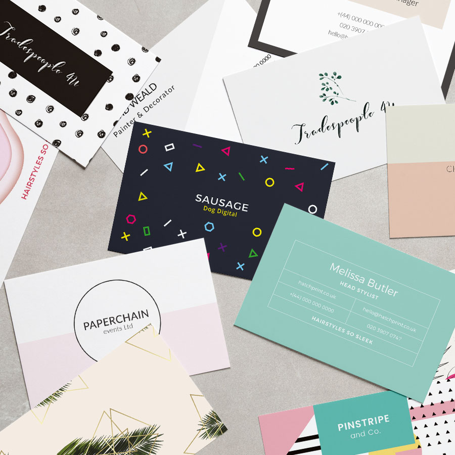
Content: less is more
You have so much to say, we know. But adding all your ideas, messages, products, promotions, and USPs, in one material can be overwhelming – I got tired of just saying it! Therefore, it’s imperative to choose carefully what to promote.
Our recommendation is: keep it simple, choose one key message and shout it aloud. Keep in mind what material you are designing as this will influence how much content is appropriate. A business card has limited space, while a folded leaflet gives you the opportunity to organise your copy within sections.
Remember the two things you should include in every material: your logo and one contact detail, that could be your email address, a social media link, or your website.
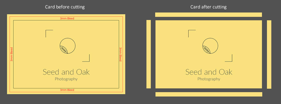
The technical bits: size, margin, trim, bleed
When designing your materials, you should keep in mind these key terms:
- Size: find out the correct size of your material, so you know how much design you need to create
- Trim: trim marks indicate where the product will be cut down to the desired size.
- Margin: similar to the margin in your Word document that guarantees all your information will be printed, you should add a margin to your artwork. Within this margin is called the ‘safe area’ and all your design and copy should be within this space to ensure none of it will be cropped when the material is trimmed to size.
- Bleed: this is the area between the trim marks and the rest of the paper. Commonly, the bleed is 3mm but it can also be 5mm. Extending your artwork to the bleed area guarantees there won’t be any unprinted areas in your material.
For more technical tips on your artwork, check our FAQ page
Peace of mind with Hatch: we offer a free artwork proofing check, meaning you can rest assured we will check your documents for bleed, colour, fonts; and contact you if anything needs changing.
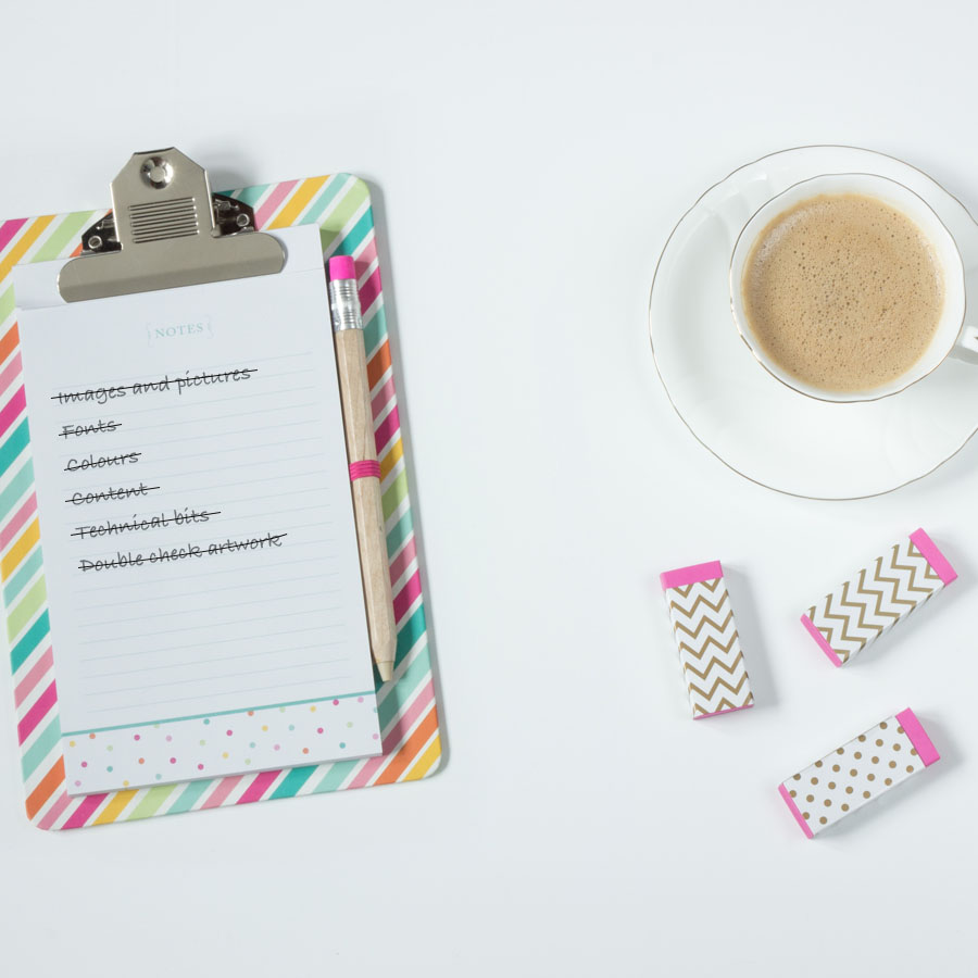
Check your artwork: once, twice, third time’s a charm
It’s easy to fix mistakes digitally, however any mistakes on your printed materials can be costly. That’s why we recommend you proofread it, again, and again, and again.
Spell check, thoroughly. There is nothing worse than a spelling or grammar mistake to make your business look unprofessional. Pay particular attention to your contact information; your name, number, and that your website is typed up accurately.
Ask a colleague to check if for you – a fresh pair of eyes can see things in a new perspective.
Count on Hatch
Hatch offers high quality on all printed materials for your business. With an easy-to-use design tool, free online proofing, amazing customer service and a range of delivery options, you couldn’t be in better hands than with Hatch.
Previous Post
Next Post
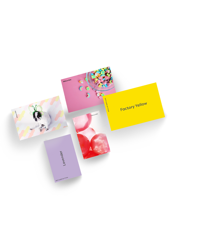
Get a free sample pack
We are proud of the high quality of our products. But don’t take it from us… order a free sample pack and see for yourself.
No hidden costs, simply add your address and we will get it in the post same day.
Get your pack now