Avoid these six most common design mistakes - Part 1
With digital technology playing a bigger and bigger part in our lives, we’ve all gotten used to the functionality available at our fingertips and can easily forget that, when it comes to print, the rules of the game are completely different.
As we want your printed materials to look as awesome as you imagine, we listed the 6 most commonly made design mistakes, so you can avoid all of them when submitting your design to print. In our part 1 blog post, you can find our first 3 top tips:
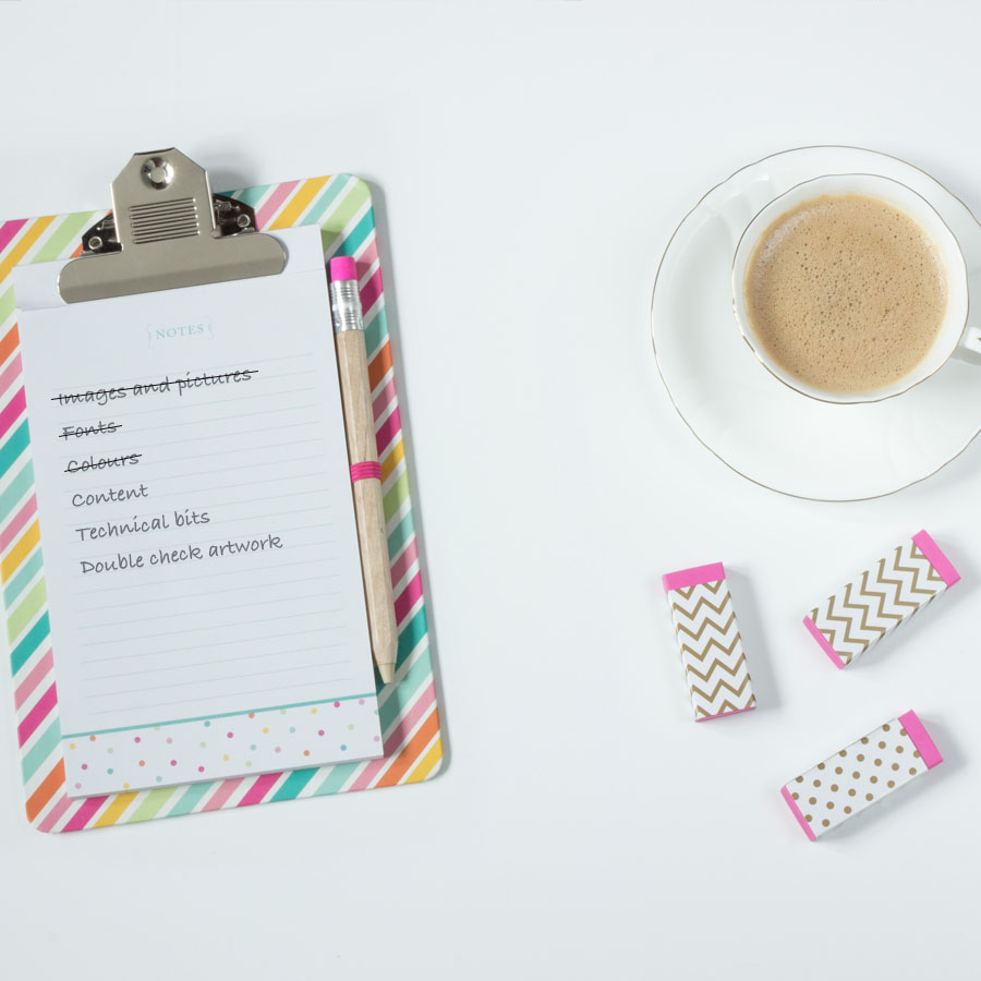
Images and pictures: ensure the colour mode is set to CMYK and the resolution is 300dpi
As the saying goes, a picture is worth a thousand words. Although we totally agree, it can only be true if your image is clear to your customers. So, don’t waste the chance to make an impact, and keep these tips in mind when choosing a picture:
- * Does it represent your business and products? This is your time to shine - choose wisely.
- * Ensure the resolution is 300dpi – ‘dpi’ stands for ‘dots per inch’, and, as you may have guessed, the more dots, the higher the resolution, resulting in a more defined image when produced in ink. Images for digital screens, such as TV or computers, usually require only 72dpi; and emails or WhatsApp can reduce the image resolution when forwarded to another recipient, so be mindful of the source of your image. Although 150dpi can be acceptable for print, we recommend 300dpi for best impression.
- * Set the colour mode to CMYK. Again, opposite to digital screens that use RGB as colour mode, print is based on the four colours in the CMYK mode: cyan, magenta, yellow, and black. If you submit a file in RGB, our system will automatically convert it to CMYK; however, this could distort your colours – so, for higher control over colour output, submit all your images in CMYK.
Peace of mind with Hatch: Whether you are uploading your own artwork or creating your materials online, our easy-to-use tool will warn you if the resolution isn’t sufficient with a friendly alert. Plus, our free proofing will check if your images are all converted to CMYK and we will let you know if anything needs amending.
Fonts: type and size can make it or break it
The most important tip here is to ensure your customers are reading it, not guessing it. Typography is an influential design element and it should not only match your brand style, but most importantly, get your message across. Ensure the font you choose makes your copy easily readable.
Beware of the font size – keep in mind it may look different from what you see on the screen. On your phone or computer, you can zoom in to enlarge small wording, but when printed, you won’t want your customers squinting their eyes to read your text. As a rule of thumb, don’t go smaller than 8pt, but you should always consider the size of the material you are printing – posters, for example, may require a larger font size for maximum impact.
Hatch tip: If you are uploading your own design, it’s recommended that you embed all fonts into your document for accurate printing; if you are creating your design with our online tool, you can choose from an extensive library of font styles.
Colours: just the right amount
Your printed materials should represent your brand. Keep within your corporate colours to ensure consistency and brand recall. If you want more adventurous colours, we recommend choosing complementary colours, because, as the name suggests, they will work well together.
Don’t overdo it – simplicity is key. Black and white can be just as memorable as colourful material. If you are using colour as background, be sure to mindfully select the colour of the font for your copy, to ensure the text is still clearly visible.
Count on Hatch
Expect nothing less than outstanding quality with Hatch – from our easy-to-use website, intuitive online design tool, awesome customer service, flawless printing and great delivery options, we are here to help your business grow.
Look out for ‘Avoid these six most common design mistakes - Part 2’, with three more design tips – coming soon!
Previous Post
Next Post
Get a free sample pack
We are proud of the high quality of our products. But don’t take it from us… order a free sample pack and see for yourself.
No hidden costs, simply add your address and we will get it in the post same day.
Get your pack now